


Site Basics
In the video gallery above we start with setting up a site, we then look at a very important thing which is the "web safe" area of a site, and from there we go on to designing the crucial site elements - the menu, the header and the footer which will all be displayed across the site on all pages.
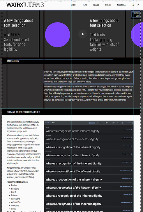
Setup

What you are seeing in the screenshot above are the three basic areas of a web page:
-
The header which is a static element that is fixed with exactly the same information throughout the site on the top of each page. The header contains:
-
the logo which is branding information,
-
the menu which is navigational information.
-
-
The footer which is also a static element that is at the bottom of all pages.
Designing the Header
-
The header aligns your whole site by giving you alignment points with 4 vertical guides - 2 each on the sides of the logo and the menu as the screenshot on the left shows you.
-
Headers should not take up too much space since through the menu that is on them they are really only a navigational element that takes you from page to page.
-
The header holds your logo. So place your logo either
-
on the left which is usually a very good place for it (example 1)
-
or center it in the middle (example 2 and 5)
-
or move it to the right, in which case your menu can go to the left or below it (example 3)
-
-
You can also place your menu below your logo, but then the the header height will increase (example 3)
-
The logo is for branding and the menu is for navigation.
-
So, whenever you decide to place these two things close to each other it is a good idea to use a stroke between them as a separator (example 2 and 3)
-
-
If you are using a circular logo take only the icon for the header and then use the full logo only on the home page (example 4)
-
You can also use vertical menus (example 5), however, again, be aware that these unless they are made to fit a narrower vertical space these will increase the height of your header.
Examples

KIZGIN
KEDİ

KIZGIN
KEDİ
KIZGIN
KEDİ


KIZGIN
KEDİ
Designing the Footer
Unless you are a company who, in addition to the basic contact and social media information also has things like "terms of service" or FAQs you may find very little to put on your footer. What most of us can show is contact information, legal disclaimers and things like social media links. As long as you display these in a clean way that is really all that you need to do.
What will help the design of your footer are social media icons. Do not to settle for what Wix has to offer you but to go and find some of your own and use those. Here is the video that shows you how to do that.
Examples
Website: https://www.elifayiter.com
Original Wixtrix Blog: https://wixtrix.blogspot.com
Contact: ayiter@sabanciuniv.edu


Website: https://www.elifayiter.com
Original Wixtrix Blog: https://wixtrix.blogspot.com
Contact: ayiter@sabanciuniv.edu


Website: https://www.elifayiter.com
Original Wixtrix Blog: https://wixtrix.blogspot.com
Contact: ayiter@sabanciuniv.edu
Website: https://www.elifayiter.com
Original Wixtrix Blog: https://wixtrix.blogspot.com
Contact: ayiter@sabanciuniv.edu
Designing the Menu
Unfortunately, this is the way the basic horizontal Wix menu looks when we first drag it onto the page.
-
The text is much too big.
-
The items are much too widely spaced.
The way this is, it would take up a very big area of the header, practically leaving no room for the logo or anything else.
But then we see another problem when we roll over it and find out that the submenu is all over the place, nothing aligns properly, we cannot even see clearly what we are looking for.
fıxıng the ıssues
01
Go to the layout button and fix the submenu, so that everything is aligned under the top menu item and does not appear sprawled all across the header.
02
Go to the design palette (brush icon) and fix the text sizes by making them smaller.
-
Depending on the menu template that you have you may have to create a special Heading Style from the site styles tab.
-
12 - 15 pixels will be a good size for most uppercase menus
-
An extra pixel made be needed for lowercase menus.
-
-
Go through all the tabs, for menu container, menu items and submenu items to make sure that everything is the correct size.
-
Set backgrounds for submenu items so that they van be seen even when they drop on your pages.
-
Go back to the layout palette and check that
-
the vertical spacing and padding values look good on the submenu
-
test whether a left or a centered alignment works better.
04
Menu Tips:
-
Careful with color - even on hover items! A menu is a text item like any other and usage of color is very problematic with any textual element since even a tiny amount of it will clash with visual material.
-
Make menu texts uppercase rather than lowercase. These are small words which stand by themselves, and uppercase will give them a much better top alignment of characters.
03
Set the design style of your menu by playing with strokes that you can place between or underneath the menu items.