


The Logotype
Your website will have an identity that is displayed primarily through a logotype that will probably be put on the header although it can be in other places as well.
So, what is a logotype?

Logotype Categories

Logos fall into three classifications (which can be combined): Ideographs are completely abstract forms; pictographs are iconic, representational designs; logotypes depict the name or company initials.
A logo is a graphic mark, emblem, or symbol used for public recognition. It may be of an abstract or figurative design or include the text of the name it represents as in a logotype. A logo is the central element of a visual identification system. Therefore, the design of logos and their incorporation in a visual identity system is one of the most important things that we do in graphic design.
In order to put a together a basic logotype we will mostly be talking about combining typography with icons.
-
On this page we shall mostly concentrate on the typographic component,
-
although the examples below will show combinations between text and icon.
-
-
More info on the icon component is on a separate page that you can find here >>>.
Picking Fonts for a Logotype


The short videos in the gallery above will give you a quick overview of the types of visual clues to look out for when you select fonts. These apply to all types of text but become especially relevant when it comes to typefaces that are used in logotypes where the typography will be a standalone element that needs to be particularly strong in attributes such as flow, consistency, distribution and so on.
However it is not only the visual attributes that matter since fonts are like people:
-
Fonts have personalities! Some fonts are adaptable, which means you can safely use them for any topic. The way you can tell that a font is adaptable is by asking yourself "does this font remind me of anything?" A place, a period in history, a geography, a particular culture, an emotion? If your answer is "no, it doesn't remind me of anything. I just read it" then this will be an adaptable font. If your answer is "yes - this reminds me of, for example, a Chinese restaurant or a soccer game or Game of Thrones" then this will be strong font that you would be wise to stay away from.
-
Bottom line: Stay way from "fancy" looking stuff!
-
Do not try to be "different"! That rarely works when you choose fonts. The difference will happen when you put them together with other things.
-
Stay away from the "cute" stuff. Childish looking fonts such as comic sans. They only work in specific contexts.
-
While the "cute" stuff should be avoided you should look at the new generation handwritten fonts, provided your subject matter is appropriate to that. Remember, fonts have personalities and the personality of a handwritten font will usually be that it will relate to "personal" things such a lifestyle, health, food and so on.
-
Sans serif fonts are better for contemporary subjects. Serif fonts are better for classic, "serious" things.
-
Please go to the bottom of this page to find a list of recommended font sites where you will find a big selection of fonts that are good for logotype texts.
Logotype Design on the Wix Editor
You can of course put together a logotype on photopea (to where you can also upload your own fonts), however a really efficient way to make a logo is to assemble in the place where it will actually live, which in our case is the Wix Editor. Create a blank page and hide it so that it does not appear on your menu. Then start playing around with icon and font combinations, which is what I did in the examples below. When you are happy with something scale it down to fit the header and drag it there to see if it is working.
groundrules
-
Size Relationships: These should not be arbitrary, you have to give them some thought.
-
You can make the 2 objects of equal height as you can see in example 1 (width will hardly ever work btw, since it will make the icon way too large)
-
You can make the icon larger. When you do this you still have to maintain a relationship that does not overwhelm the text since the text is always number 1 in the hierarchy. Again, when you do this always remember the golden rule that everything needs to be aligned - round icons (or things that are amorphous or very close to round) get aligned from the middle (see examples 2, 5, 6 and 7), straight icons get aligned from the top or the bottom.
-
You can make the text larger in relation to the icon (see middle alternative in example 7). This has to be done quite carefully, since the text is already number one in the hierarchy and making it larger than the icon (again, we are talking about height not width) could very easily overwhelm the design, rendering the icon "invisible".
-
Alignments: These are actually the most important element of any good graphic design products, not just logotypes. What to pay attention to is:
-
Straight objects get aligned either from the top or the bottom
-
Round objects get aligned from the middle.
-
Everything gets aligned. Literally everything. Not just logos - everything! :-)
-
-
Weight Relationships: These can be
-
Harmonies where the weight of the 2 objects is almost equal (see examples 1, 4 and 5 below) or
-
Contrasts where the 2 objects have distinctly different weights. (See examples 2 and 6).
-
-
Spacings: These should not be arbitrary.
-
You can create tight clusters (see example 1, 3 and 4)
-
or place the icon and the text at a distance which you should calculate in such a way that the two do not break apart too much but also don't stay close enough to form a cluster (see examples 2, 5 and 6)
-
and, when needed, you can also emphasize the spacing of the 2 objects by using a separator (see example 7).
-
-
Clarity: This is already a topic in one of the 6 short videos above when it comes to fonts. However, it isn't only the font your entire logotype, icon as well as font but also how you use contrasts, spacings, weights, alignments - everything should be clear and unambiguous.
-
No ambiguity! What we dread above all else in graphic design (and all other design fields, including architecture) is ambiguity, which is the state where our eyes are not exactly sure of the attributes and the visual relationships of the things that they are looking at.
-
No Color! The golden rule is no color on text - only black white and grey. Icons can eventually become colorized, however only after you have finalized your design in black and white since anything outside of black and white will conceal mistakes that you will only see in stark black and white.
Examples
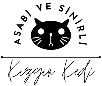
01
This chunky icon got combined with a chunky text which is Josefin Sans Bold, so in this design I shot for a harmony between font and shape - both are bold and chunky. I aligned the bottom of the text with the bottom of the icon, since that gave me a very clear line. The top I eyeballed to align roughly to the middle of the stroke that makes the head shape.

KIZGIN
KEDİ
02
Here I did the opposite of what I did above: I went for a strong contrast. Very heavy icon, very light text. This is not a combination that happened right away - I played around quite a bit before I decided on this combo. The font is Barlow Semi Condensed Thin.

MANYAK TAVUK
03
This is the first of 2 versions. It is not the one I used in the end but I still want to show it. The cat was made white in photopea and then I placed it inside a dark container here in Wix. The alignment is from the bottom and the top of the text aligns with the back of the cat.
KIZGIN
KEDİ

04
This is the version that I actually ended up using and you can see it in action here >>> where I combined it with a long dark menu.
I uploaded many many cat icons and many fonts and played around with all of them. And that is what you should do as well. First off, it is a lot of fun, and second the more you experiment the better your result will be.

KIZGIN
KEDİ
05
I aligned the text with the middle of the cat head (remember round things always get aligned from the middle. You can see the final usage of this here >>>

KIZGIN KEDİ
06
With handwritten fonts you should be looking for a font that looks natural, like as if it really was written by somebody rather than something that is algorithmically generated - which is what a font is, after all.
The ones that look more natural have a horizontal flow rather than a vertical one since that is how we usually write as well. The two examples at the top and middle are such horizontally flowing fonts. However, obviously there can be exceptions as well. The bottom example is made out of a font that is more vertical in terms of flow, but I had to look for a while to find this font to put as an example for such an exception.

Kizgin Kedi

Kizgin Kedi
When it came to combining the icon with a handwritten font I had to look for alternatives that actually work, the ones I used above would have been too strong as shapes to create a good relationship to the text, which with all three of these is a contrast in which the strong part is the text. The top and bottom set up a contrast with a very light line drawn icon and a heavier text, while in the middle I used size as a contrast element by placing a very small solid black cat icon next to a light weight text.

Kizgin Kedi
07
Separators are "helper" elements that we sometimes have to use in order to pull a design together. These can be strokes or boxes (as containers for an element) that provide separate visual spaces for the components of one design.
In the top example here I added a stroke separator between the text and the icon. If you look at the bottom one which is the same combo, however without the stroke, you will see that in such a case the separator is a good addition since the vertical shape of the icon and the horizontal line of the text do not seem to find it too easy to inhabit the same space.

KIZGIN KEDİ
KIZGIN KEDİ
Logotype Design on Canva
Creating a circular text logotype is not possible on Wix. There is however, a very easy to use online platform called Canva that one can use to make such logotypes as you can see in the video tutorial here >>>.
Note: These logos are quite high and if you try to put them on your header, the header will become very deep, taking up quite a bit of viewing space on your pages. So, a logo like this can only be used as a full version on a homepage or the top of a micro site. And then on a multipage site only the icon of the logo would be placed as a "reminder element". Watch this tutorial here >>> before you decide to go ahead, to see if this something you would want to do.
The one thing to add to the list of rules above is that a circular design is something that starts from a visual middle and therefore the alignments should also refer to that middle, rather than the edges.


.png)
Font Portals
The basic go-to portal that gives a very good range of creative commons licensed fonts that are also searchable by language groups and the size of the font family. Recommended for logo fonts, highly recommended for text fonts.
A very wide selection of fonts, also good for handwritten fonts and more interesting sans serifs and some very elegant serif typefaces. Also lets you see the languages and gives a list of similar fonts at the bottom. Highly recommended.
One of my personal favorites, they have a very nicely curated collection of free fonts. Very good for elegant serifs fonts, handwritten and script fonts. Highly recommended.
I am not sure whether Dafont Free is associated with the old dafont website, which I will link to separately below. This is a very good portal, again, especially if you are looking for handwritten fonts or display fonts. Another very nice feature of dafont free is that it searches for free fonts that are close alternatives to a proprietary font that you are looking for. Highly recommended.
One of the oldest creative commons font sites online. Has been around for decades and is still very good, especially for the way in which they set up their categories at the top - not only for visual attributes but also as concepts. Highly recommended.